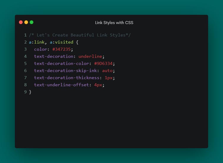
Hyperlinks don’t always get the attention they deserve from web designers. Sure, we might make a few tweaks. However, we don’t always go the extra mile to make them stand out.
Perhaps that’s because the styling options used to be limited. Link color and underlining were the primary options. Hover and focus states seemed to be where most of the creativity occurred. Other enhancements tended to require add-ons like JavaScript.
CSS has changed the game in recent years. Several properties are available to customize the look of hyperlinks. They also provide a higher level of control regarding details like spacing and sizing.
It’s a whole new world of possibilities. Let’s check out some CSS properties that help make hyperlinks more attractive.
A Default Link
We’ll start with a default link configuration. A link color and CSS states were added – but that’s it. It will serve as a baseline as we explore the CSS properties below.
See the Pen Link Styling:Plain by Eric Karkovack
It used to be that a link’s underline had to be the same color as its text. The text-decoration-color property allows us to choose a separate hue. It also works with overlines, strikethroughs, and anything else set by the text-decoration property.
We’ve added a brown underline to compliment our green link text.
See the Pen Link Styling:text-decoration-color by Eric Karkovack
This niche property determines how the link’s text decoration interacts with glyphs. The default setting is auto, where the browser interrupts underlines and overlines so they don’t touch a glyph. You’ll notice this with lowercase letters that go below the baseline.
Setting the property to none means the underline or overline draws a straight line – regardless of where glyphs are located.
See the Pen Link Styling:text-decoration-skip-link by Eric Karkovack
The thickness of a link’s underline typically follows what’s defined in the font-weight property. That is, bold text will result in a thicker underline. This property lets us set a consistent value for every link in the cascade.
See the Pen Link Styling:text-decoration-thickness by Eric Karkovack
Text decorations don’t have to be a straight line. This property lets you change the style to dashed, dotted, double, or wavy lines.
See the Pen Link Styling:text-decoration-style by Eric Karkovack
Here’s a way to specify how closely (or not) an underline is to the text above. Adding a few pixels of space between them can improve legibility.
Note that this property doesn’t impact instances of the HTML underline tag (<u>). It only affects instances where the text-decoration property is set.
See the Pen Link Styling:text-underline-offset by Eric Karkovack
Another niche property, text-underline-position specifies the position of the underline relative to its text. Setting it to under is ideal for mathematical and scientific formulas. It makes subscript characters easy to read – even when underlined.
See the Pen Link Styling:text-underline-under by Eric Karkovack
Going Further with Link Styles
Hyperlinks don’t have to be bland. There are now plenty of ways to make them as much a part of your brand as other design elements.
The properties above are all worth considering when styling links. They’re relatively simple to implement and can make links more attractive and accessible. Best of all, they’re native CSS and won’t impact page load performance.
You can also use them beyond default styles. Style them for various states, such as changing the link’s underline color during a hover event. In addition, there’s an opportunity to add animation and transitions to create all sorts of fun micro-interactions.
Just beware – it’s possible to take things a little too far. Always keep best practices in mind to enhance the user experience. Anything that makes links harder to read or use isn’t worth doing.
It’s time to get creative! Experiment with these CSS properties and see how you can bring a little life to your links.
Related Topics
Top


