A while ago I thought it would be a great idea to send out exclusive demos specifically for our newsletter subscribers, hoping to attract more readers. Codrops operates on sponsorships, particularly from sponsored articles and the Collective, so acquiring more subscribers equates to maintaining our momentum, generating demos, and curating the Collective weekly.
But we heard your feedback. Making exclusive demos simply isn’t the Codrops way, as we offer all our demos for free without any requirement of subscription or payment.
So today I’m happy to release the exclusive demos we’ve created for our subscribers to all our readers, subscribers or not. From now on our newsletter subscribers will only receive the Collective.
With that, I’m also happy to refocus on what is already in the oven for way too long: a much needed redesign of the blog. It’s crazy how difficult it is to make something so simple right. Especially something so simple. But I hope I will get it right and make Codrops a better web experience.
Anyway, here are the four demos.
This is a background/foreground slideshow inspired by Exo Ape’s slider. We’ve added our own unique twist and included a second demo with a different effect. Exo Ape’s website is known for its sleek and smooth interactions, and last year, Robbert Schefman shared a fascinating Dribbble shot of a double slideshow animated in opposite directions. We were inspired by this concept and created our own fun demo and variation of the effect. You can also navigate between the pictures by swiping or scrolling.

This set showcases a creative way to add interest to your website’s typography using scroll animations. The effect is based on an animation that you can see on the website of EPIC and takes advantage of the scrolling motion to bring words to life in a unique and visually appealing way.
We’ve created 4 distinct effects to spark some inspiration on how you can animate your own typography.

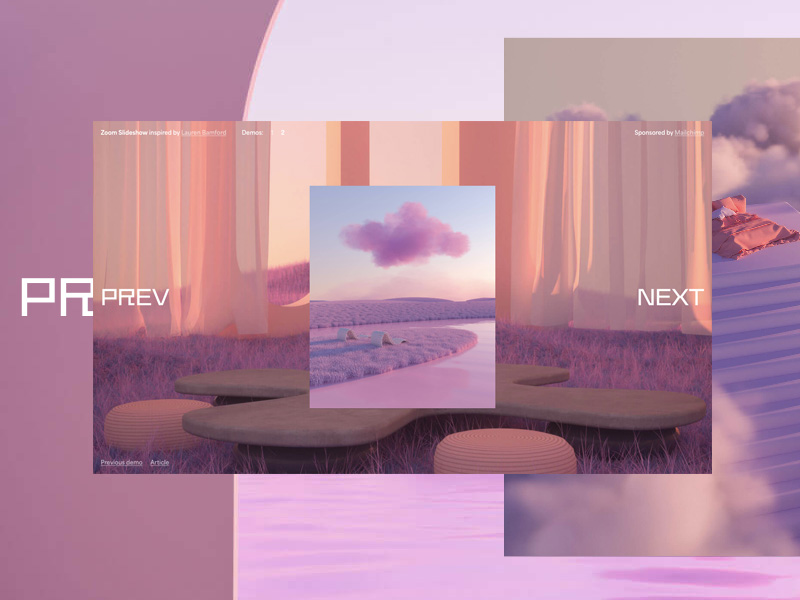
Next is a slideshow effect that is based on Lauren Bamford’s website, created by Patrick Mason. When navigating the slideshow (either by scrolling or by clicking the nav buttons), the current smaller image zooms in, making it fullscreen while another image animates in (and the process reverses when we go backwards).
We’ve made two demos: one that looks exactly like the one on the website and one that shows a little twist. Although this effect looks pretty straightforward, its trickiness lies in managing the various states of the slides as we are looking at the current one, the incoming one and the previous one to that.

This demo is all about fun typographic hover effects. It’s a set of simple letter animations with a unique twist: animating a line along with them.
We’ve prepared eight different hover effects with individual looks that are easy to adjust. You can tweak the colors, typography, and line style, as well as the animations themselves (using GSAP).

Hope you enjoy these demos and find them useful & inspiring!


