Excel is a great tool for all of your marketing needs. You can create graphs to visualize your data, use formulas to calculate conversion rates, or even create social media calendars.
You can also monitor trends in your marketing campaign data and, in this post, we’ll explain how to do so with the sparklines tool.
Already know what you need? Jump there with our Table of Contents.
What are sparklines in Excel?
Sparklines are charts in individual cells that provide visual representations of trends in your sheet data. For example, if you track month-over-month progress, a sparkline can show you how each month compares to the other.
There are three different sparklines you can add to your Excel spreadsheets: line, column, and win-loss. The image below is an example of a line.

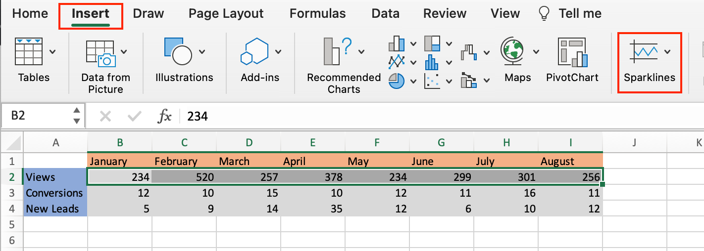
For this walkthrough, we’ll use a sample data table (shown below) that tracks views, conversions, and leads generated from a marketing campaign.

Let’s go over how to add your own.
How to Add a Sparkline in Excel
1. Select the cells you want represented in your sparkline chart. In this example, I’ve selected all the cells between B2 and I2.

2. In the header toolbar, select Insert, then Sparklines.

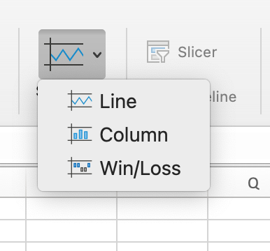
3. You should then see a dropdown menu where you can select the type of sparkline chart you want: line, column, or win-loss. I selected a line for this example.

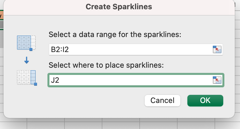
4. After you select your preferred chart, you’ll see a dialogue box appear (as shown below). In the Select where you want to place the sparkline box text field, enter the cell that you want the sparkline chart in.

It’s best practice to have the sparkline immediately next to the string of cells you’re creating the chart for so you can get a full visualization and quickly refer back to your data.
For this example, I selected cell J2.
5. Your sparkline chart should appear in the cell you selected. The image below is the sparkline for my sample data set, and it shows the trend in views over time for my marketing campaign.
 Below we’ll go over the steps to creating a different type of sparkline.
Create a Column Sparkline in Excel
If you want to use a column sparkline in Excel, repeat steps one and two from above. When the sparkline selection box opens, select column instead of line. The image below is a column sparkline.
 Follow the same process if you want a win-loss sparkline. The image below is an example of what this chart looks like.

How to Ungroup Sparklines in Excel
You’d want to ungroup sparklines in Excel if you want each of your rows to have a different sparkline. For example, if you want rows two and four to have a line chart, but row three to have a column. Let’s go over the steps.
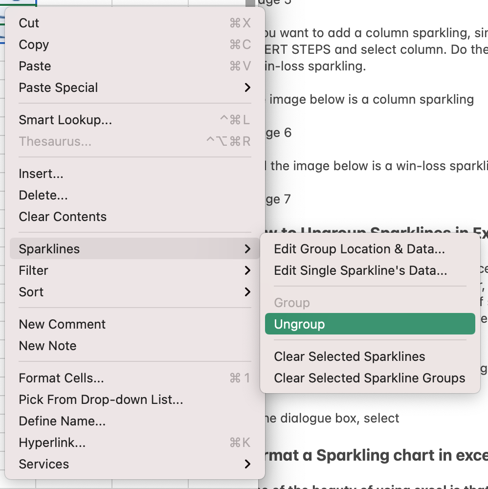
1. Right-click on the sparkline you want ungrouped. For this example, I right-clicked on column J3.
2. In the popup menu, select Sparklines, then Ungroup.

3. Click on the sparkline you want to change, navigate to the Sparkline header toolbar, and make your chart selection.
The image below is an example of what it looks like when you ungroup sparklines and use different charts.

Format a Sparkline Chart in Excel
A benefit to using Excel is that you can always format your spreadsheets to your liking, and this goes for Sparklines too. Let’s go over some formatting changes you can make.
How to Mark Data Points in Sparkline Charts
1. Select the sparkline you want to edit and navigate to the Sparkline header toolbar and select your preferred data marker, as shown in the image below.

If I select High Point, my corresponding sparkline chart will have a marker displaying the month with the highest view count.

How to Color Code Excel Sparkline
Select the sparkline you want to edit and navigate to the right-hand side of the Sparkline header toolbar, as shown in the image below.
 You have the option to change the color of your sparkline, the color of your markers, and the weight of your sparkline.
Over To You
Now that you know how to create a sparkline chart, you can expertly monitor trends in your marketing campaigns that will help you quickly view the success of your processes.


![Download 10 Excel Templates for Marketers [Free Kit]](https://no-cache.hubspot.com/cta/default/53/9ff7a4fe-5293-496c-acca-566bc6e73f42.png)


