In the days before CSS existed, the web looked different. Or perhaps I should say that it all looked the same. There were few styling options, after all.
Text-based hyperlinks are a great example. Virtually every website used the same default shade of blue. It was possible to change the link color. But most sites tended to stick with blue.
Yes, it was boring on the surface. But it was also a great way to help users quickly spot links. Designers couldn’t implement fancy styles. And so, the first generation of web users learned to look for blue, underlined text.
Then CSS came along and completely changed what was possible. Hyperlinks could be any color of the rainbow. They could also sport backgrounds, animations, and custom typography.
Plus, we could change link styles based on context. That made it possible to have differently styled links in your header and content areas, for example. It’s great to have options. But there are also some drawbacks.
Sometimes we take custom link styling too far. We trade simplicity for complexity. That can make it harder for users to discern. It impacts both usability and accessibility.
So, what should we keep in mind when styling hyperlinks? Here are some tips for making them beautiful and keeping them usable.
Make Hyperlinks Easy To Recognize
Users are more web-savvy than they were a few decades ago. Web designers recognize this. But it sometimes leads them to give users a bit too much credit.
We see examples in links that are barely perceptible. Perhaps the link color is nearly identical to the rest of the text. Or the underline blends into the page background.
Subtlety has its place in design. But that doesn’t apply to hyperlinks. They need to stand out – regardless of how you style them.
The link’s color should contrast with other text. And it needs to pass accessibility guidelines as well.
Links should also include one or more design features. That could be an underline or a change in font weight. This helps colorblind individuals discern a link from plain text.
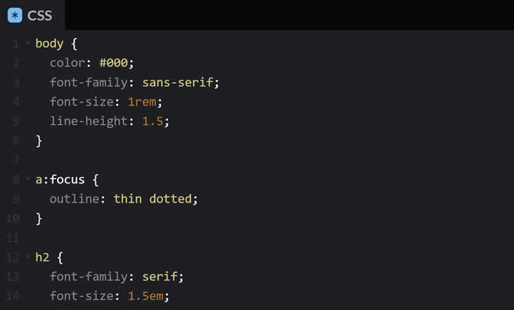
Another accessibility note: always use the outline property on the link :focus state. Users navigating via the keyboard can more easily identify your links. We’ve used it within all snippets here.
See the Pen Styling Hyperlinks:Make Them Recognizable by Eric Karkovack
Underlines Should Be the First Choice
CSS opened the floodgates in terms of how we style hyperlinks. And many designers used it to remove underlines.
Jettisoning underlines may result in a “clean” look. However, it also makes links harder to recognize. It’s particularly troublesome in body text.
Long passages of text can frustrate users. It becomes hard to maintain focus. But things get worse when they can’t spot any links within.
That’s why underlining links should be your first choice. It’s a simple feature that makes skimming content easier.
The unfortunate thing is that client preferences can get in the way. Some associate underlines with old school web design.
This is a great time to educate them. Explain how underlines help users get where they need to go. The
added convenience could result in more conversions. Hopefully, that will convince them to put users first.
Besides, we can use CSS to make underlines more attractive. The text-decoration-color and text-decoration-style properties add plenty of styling options. Underlines may be old-school, but they don’t have to be boring.
See the Pen Styling Hyperlinks:Use Underlines by Eric Karkovack
Ensure That Styling Is Consistent
Link styling should also be consistent. Navigating a website will become more predictable. Users won’t have to think twice about how to get around.
Every link doesn’t have to look the same, however. Context also plays a role here. For example, you may use different styles in your site’s header and footer. And content within a sidebar could look different than the body text.
These different styles should be implemented within reason, though. The look should fit a defined pattern.
Using radically different typography, for instance, may throw users off. As with other design elements, there should be a rhyme and reason in how links look and work.
See the Pen Styling Hyperlinks:Stay Consistent by Eric Karkovack
Links Can Be Beautiful and Functional
Styling hyperlinks runs the gamut. Some web designers completely ignore them. Others add a kitchen sink worth of custom CSS.
When it comes to usability, the former is probably the safer path. Users will be able to spot links in the middle of your content.
Still, it’s possible to achieve a balance. You can create custom styles to dress up links to match your brand. And you can do so in a way that keeps users in mind.
Therefore, don’t be afraid to experiment with link styles. Just keep your site’s goals along with best practices in mind.


