Where would web designers be without CSS? It wasn’t so long ago that something as simple as a drop shadow required the use of graphics. Now, it’s a matter of writing a line or two of code.
That’s great for adding some basic effects to your text and containers. But it’s also possible to go above and beyond. With CSS, you can create some seriously impressive shadows that rival those found in tools like Photoshop.
These effects help elements stand out while providing depth and visual perspective. It’s amazing what a little bit of shadowing can do for a design.
We scoured CodePen to find prime examples of CSS shadow effects in action. Here are some top snippets that cover both everyday sensibility and jaw-dropping complexity.
Beautiful CSS box-shadow by Airen
The CSS box-shadow property is incredibly flexible – and this snippet is proof. With 90+ examples of different effects, you’re sure to find one that suits your needs. Bookmark this one as a handy reference.
See the Pen Beautiful CSS box-shadow by Airen
Error 404 Page design BOOTSTRAP by Ahmed
This 404 error offers a unique take on shadowing. It combines CSS transforms and absolutely-positioned elements to create a skewed look for each container. The result is a cool aesthetic with a standout visual flow.
See the Pen Error 404 Page design BOOTSTRAP by Ahmed
Strokes, Shadows + Halftone Effects by Mark Mead
The creative use of shadows can take your work to some fun places. Here, they’re utilized to craft a selection of offset looks, including halftone SVG patterns. They create a lighthearted mood that would fit in nicely with features such as page titles and hero areas.
See the Pen Strokes, Shadows + Halftone Effects by Mark Mead
Netflix style text animation with CSS by Nooray Yemon
The “Netflix” effect seen here includes an iconic long shadow that disappears into the final result. It’s a relatively basic CSS keyframe animation, yet makes a bold impact – just like the opening of your favorite shows. Even better is that you can customize the text right from within your browser.
See the Pen Netflix style text animation with CSS by Nooray Yemon
Neon text-shadow Effect by Erik Jung
We tend to see shadows used to create contrast – that’s not the case here. Instead, the text-shadow property provides these characters with a neon look. Add in a bit of animation and you have an attention-grabbing headline or logo.
See the Pen Neon text-shadow effect by Erik Jung
Animated CSS Mail Button by Jake Giles-Phillips
Shadows can also be used to enhance lighting effects, much like we see with this envelope. Hover over the object and notice how the perspective shadow shrinks as the envelope moves closer to it. While it’s not the main attraction, it certainly adds a touch of realism.
See the Pen Animated CSS Mail Button by Jake Giles-Phillips
Layered text-shadow effect CSS by Shireen Taj
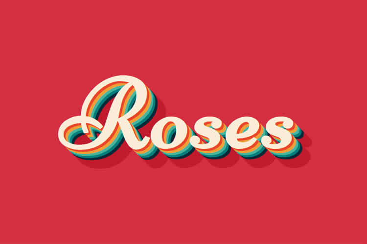
Among the hidden tricks behind text-shadow is the ability to layer shadows – all within the same property. In all, there are a whopping nine layers used to create this multicolored 3D text. And while this snippet has a cool retro vibe, there are plenty of additional possibilities.
See the Pen Layered text-shadow effect CSS by Shireen Taj
Shadow on Shape by Chris Coyier
Adding a shadow to a non-rectangular shape may not seem like a big deal. But it wasn’t always possible on the web. Here, Chris Coyier demonstrates that, by using the CSS filter property, we can create a shadow that perfectly follows along the path of a custom shape.
See the Pen Shadow on Shape by Chris Coyier
Step into the Shadows with CSS
Yes, the classic drop shadow is alive and well. But, thanks to CSS, so are a variety of other shadow effects. This means that you can create something truly unique without leaving your code editor.
Whether you’re looking to add a subtle touch of class or something more extreme, the snippets above can show you how to make it happen. And it may be easier than you think.
Looking for more CSS shadow effects? Head on over to our CodePen collection and start browsing.


