Studies have shown recruiters typically scan a resume for onlyabout six seconds before making a decision on whether an applicant is fit for a role.
With only six seconds to demonstrate your qualifications for a position, every detail counts – including the font you use. The question is, what are the best resume fonts to pass the six-second scan?
We asked HubSpot recruiters to reveal the seven best fonts for your resume as well as what they consider in terms of design in general, so your resume can stand out in the pile.
Featured Resource: 12 Free Resume Templates
Best Resume Fonts
- Times New Roman
- Arial
- Calibri
- Helvetica
- Cambria
- Georgia
- Garamond
- Avenir Next
- Muna
With only six seconds to demonstrate your qualifications for a position, every detail counts. To evoke a sense of style, professionalism, and uniqueness, it’s critical you put effort and consideration into your font choice.
When speaking with recruiters, it quickly became clear that classic fonts are still the best options.
“I’m a big fan of the ‘classics’ for resumes – Times New Roman, Arial, Calibri, Helvetica, and Cambria. I’m a little old school, but I think they are the cleanest and exude professionalism,” said Johanna Fleming, a former senior recruiter at HubSpot.
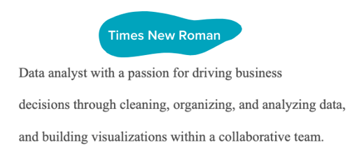
Riley Kundtz, former senior MBA campus recruiter at HubSpot, agreed.
“I find the classic formatting and Times font to be helpful when reading a dense resume from an experienced MBA candidate.”
Times New Roman has become a bit controversial lately. It was the go-to font for many years, but lately, some are opting against it.
“For me, it’s all about legibility and cleanliness – I prefer sans-serif fonts like Helvetica over serif fonts like Times New Roman,” said technical recruiter at HubSpot, Glory Montes. “Overall, I would just stay away from a font like Times New Roman, it’s overused and reminds me of long nights writing course papers in college.”
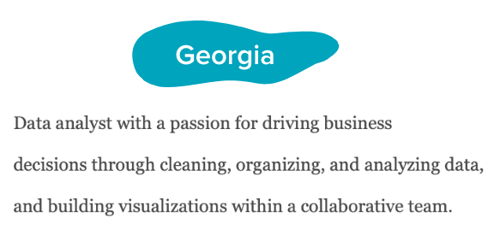
One font that’s similar to Times is Georgia, it’s a bit wider making it easier to read. In fact, it’s the font used by The New York Times.
Paulina Valdez Franco, executive recruiter at HubSpot, agrees with this take.
“My two favorite fonts are Helvetica, if you’re looking for a clean and classic look, and Georgia, if you’re going after a more modern and fun look,” she said. “The latter is also designed to read well on screens.”
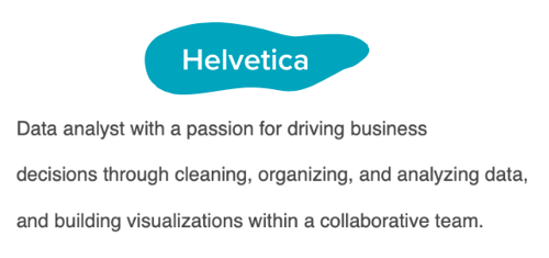
Helvetica is widely used in the advertising industry and works equally well for text-heavy pages and documents.
A lesser-known font that’s a great option for your resume is Garamond, recommended by our current team lead of engineering recruiting at HubSpot, Rich Lapham.
“Recruiters have an idea of the skills they are looking for on a resume, so if you try a new style or format, it can be tougher for recruiters to find the information they are looking for,” he said. “Keep it clean and simple.”
Franco added that Arial and Calibri are great choices if you want to play it safe.
Bridget LeMon, global emerging talent and university recruiting manager at HubSpot, echoes this.
“It’s totally acceptable – and becoming more common – for candidates to stray away from the resume norms of Times New Roman and Calibri,” she said. “Avenir Next and Muna are two great options if you are looking to break the status quo.”
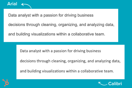
Ultimately, you’ll want to consider the position for which you’re applying when you’re choosing a font. To Montes’ point, certain more creative roles might benefit from a more unique font than Times New Roman.
Does your resume font even matter?
Most recruiters I spoke with were hesitant to even offer a font at all. Instead, they focus on the content.
“I typically don’t pay too much attention to font,” said Heta Patel former HubSpot recruiter. “I’m more concerned about whether the resume is formatted in a clean way – submitting a PDF is helpful with this, so your formatting doesn’t shift.”
Sales Recruiting Manager Kelsey Freedman agreed.
“Honestly, I don’t care much about the font of a resume, as long as it’s clear and in PDF format. I typically only review a resume for 20 to 30 seconds, so a traditional font is good. I would advise avoiding script font or bubble font, or something distracting like that.”
Ultimately, and as expected, your content still matters most. However, a clean, clear font will help avoid any irritability you might cause a recruiter with a distracting, messy design.
“What I get most excited about is the content. Depending on the role, I look to see that candidates are sharing direct and compelling snapshots of their work,” said Ashley Hodder, a global recruiting manager at HubSpot. “I look for indicators that show data orientation, autonomy, and thoughtfulness about business impact.”
Worst Resume Fonts
While some recruiters may not have suggestions for the best fonts to use, many can agree on some of the worst ones.
“Anything that is cursive, or too bubbly, is too hard to read. For instance, I’d stay clear of Comic Sans,” says Holly Peterson, team lead for UX recruiting HubSpot.
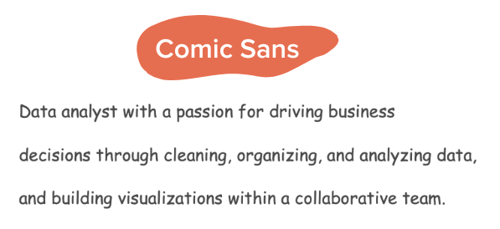
Another font type to avoid is Script.
With text-heavy documents, Script and any of its derivatives make things hard to read because they’re meant to look like they’re written by hand. 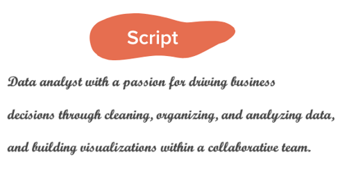
They’re generally used in hand lettering and calligraphy for artistic projects and shouldn’t be present anywhere near your resume.
Ideal Resume Font Size
When asked about which font size is best, Fleming said 12 is ideal. Most recruiters would agree.
Your text should be large enough to read comfortably without straining but small enough that there’s space to include all the key elements, such as an objective, contact information, skills, and experience.
Where you can go larger are for headings for your name and section titles.
If the font you chose is particularly wide, you can scale down to 10.5 – never going below it.
The key takeaway is that make your resume as clear and easy-to-read as possible, which means keeping the font size around 12, sticking to classic fonts with modern twists, and forsaking your favorite script font.
Editor’s note: This post was originally published in November 2018 and has been updated for comprehensiveness.


![→ Download Now: 12 Resume Templates [Free Download]](https://no-cache.hubspot.com/cta/default/53/4ec95757-585e-40cf-9189-6b3885074e98.png)
