The hamburger menu has become synonymous with mobile apps and websites. It neatly hides navigation items until users need them. They’re great for saving space when screen real estate is limited.
And we’re also seeing them utilized more on desktop devices as well. This makes sense for large, complicated menus and scenarios where content needs to be the main focus. Yes, hamburgers are everywhere these days.
What’s more, this type of navigation is incredibly flexible. A variety of reveal animations and layouts are possible, and that’s only scratching the surface. Designers are constantly redefining what happens behind this little icon.
Let’s take a look at 8 CSS and JavaScript snippets that enhance hamburger menus. You might be surprised at what they’re capable of.
CSS Animated Hamburgers by Eric Porter
Let’s start with something simple but important: the open and close interactions. This snippet features a set of click/touch animations. The goal is to make the user experience an intuitive one. Each animation here does so effectively.
See the Pen Hamburgers – CSS Animated by Eric Porter
Menu Button Interaction by Aybüke Ceylan
Here we have a snippet that puts a unique spin on the hamburger icon’s look. The offset first and third lines stand out while keeping everything recognizable. There are more goodies inside. Clicking on the icon reveals an attractive menu that appears from the upper left. The feel is very similar to a context menu often seen in operating systems.
See the Pen Menu Button Interaction by Aybüke Ceylan
Morphing a Hamburger Menu with CSS by LM Gonzalves
Open this menu and behold the outstanding CSS transition. The lines of the hamburger icon appear to morph into the individual menu items. This is sure to get a user’s attention (not to mention leaving a few web designers in awe).
See the Pen Morphing Hamburger Menu with CSS by lmgonzalves
Another Menu Concept by Rune Sejer Hoffmann
This menu’s reveal is another great example of CSS transitions. In this case, the menu becomes an overlay with a horizontal layout. The typography is spot-on, as are the sweet hover effects.
See the Pen Another menu concept by Rune Sejer Hoffmann
Animated Nav Toggle & Menu by A. James Liptak
This overlay menu features a unique twist. It uses multicolored panels, housing the navigation itself in the middle of the screen. To the left, the branding area swaps backgrounds but stays in a consistent spot. Not only does it look cool, but it also keeps users aware of the site’s brand. That’s something often lost when implementing overlays.
See the Pen Animated Nav Toggle &Menu by A. James Liptak
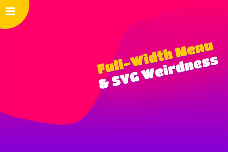
Full Width Menu & SVG Animation by Brandon Ward
If you’re looking to add a splash of fun to your project, you’ll want to check out this snippet. The combination of bright colors, smooth transitions, and hover effects makes this menu an attention-getter.
See the Pen Full width menu &SVG animation by Brandon Ward
CSS Sidebar Toggle by Silvestar Bistrovic
It seems like most overlay menus out there tend to be opaque. That’s why this example is a nice change of pace. Clicking the hamburger icon reveals a beautiful menu that utilizes a translucent gradient background. This allows you to see a portion of the site underneath while still being able to easily navigate to another page.
See the Pen CSS sidebar toggle by Silvestar Bistrović
Slide Out Navigation Menu by Praveen Bisht
We’ve seen hamburger menus that take over the entire screen. But what about a menu that simply expands into a traditional navigation bar? This slide-out snippet does so in a very clean and subtle manner. There’s something to be said for a feature that just works without making a big deal of it. Just be aware that this one may need a little extra work to make it fully responsive.
See the Pen Slide Out Navigation Menu by Praveen Bisht
The Ever-Evolving Hamburger
The hamburger menu has come a long way from its early days. No longer confined to a simple drop-down, it can take full advantage of the latest that CSS and JavaScript have to offer. And while it may not be right for every project, its utility continues to grow.
We hope these examples have inspired you to take the hamburger menu even further! If you’d like to see more tasty snippets, please check out our CodePen collection.


